Friday 30 November 2007

Inspiration I: Homeland

My parents come from an island off the coast of Croatia called Brac. I go back there as often as possible these days. The family visited a few times when my brother and I were children, but we didn't spend nearly enough summers there. When we were teenagers, we had to visit during winter which was incredibly depressing. Ah, when I think about the mischief I could have got up to had I spent the summer there as a thirteen year old...
Above: Pucisca, July 2007. A hand painted wooden chef points to a restaurant just down the road. There are no street names or signs in the town. (Population approximately 2,200.)


Above: I believe that Adria is/was a brand of clothes washing powder. Apron owned by my paternal grandmother, possibly from the 1970's. Direct inspiration: the buildings might as well be from a town on their island.
Above: folky detail from another teatowel brought back by my mother from Yugoslavia, possibly 1980's.


Above: Another teatowel, also possibly 1980's. Nedjelja means Sunday, but not much luck it seems.


Above: another of my grandmother's teatowels, probably 1970's and quite likely made from a bag of clothes washing powder which was intended for that double purpose.


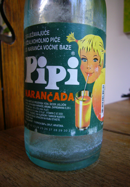
Above: Pipi fizzy orange drink. She was very special to my brother and me when we were children. I think that she is still special to my brother now.

Above: the queen of all homeland product logos: the Gavrilovic smallgoods girl. This very piece of gold printed cardboard (badly reproduced here) was wrapped around a large cajna kobasica: translated directly meaning "tea sausage". That's tea as in beverage, not the British sense of tea, as in dinner.


Above: Podravka chicken noodle soup. Just as easy to find in Clayton as it is in Zagreb.

Above: the king of homeland product logos: the Vegeta man. Vegeta is a type of vegetable seasoning/ stock, and no home in the former Yugoslavia was ever without it.

Above: Ledo, who is probably every child's favourite product logo: his cheer is for ice cream. His name is a nice combination of the word for ice: led, and the word for bear: medo.

Craft Archive: I

I am always making something: lately it's dresses, because I realised that I had alot of fabric in the house, quite a few simple patterns, and a wardrobe that was looking shabby. Usually what I make is dictated by what I 'need' at that moment. So I might end up making anything, really. Here is a random assortment of things that I have made. Above: I 'needed' a red scarf a few years ago. Winter is boring enough without everyone making it even more depressing by wearing drab colours. It even has my name on it in case I lose it. Ha!

Above: after I made the red scarf I decided I needed a scarf with pretty colours in it, and a bit more of a knitting challenge. I like this one alot.


Above: a knitted cushion, which probably started off wanting to be an entire quilt, but I got bored with it, or wanted to use my dear wooden knitting needles for something new.


Above: at some point quite a few years ago, I decided that I needed a rag rug. It was fun to do, but remains unfinished. It lives on the floor of the bedroom anyway.

Above: at some point I decided that I needed a patchwork quilt, but by the time I got to my fourth one (above) 'need' was not the appropriate word: I had been taken over by some weird quilt-making-addiction. I have since made at least eight. I need to make a new one for my bed soon.


Above and below: I needed a new case for my camera, as the old one got blown off the washing line while on holiday: fell into someone's backyard. I hope that they like red and white polka dots. I prefer this one anyway.

Sunday 25 November 2007

My T-Shirts I

I design t-shirts for a living. A few years ago, my friend/colleague Jason Parkinson and I designed a series of our own t-shirts under the label Self Service, which were sold at the Fat stores in Melbourne and Sydney; Ivy Hopes, Lupa and 188D in Melbourne, Dragstar in Sydney and Dirtbox in Brisbane, among others. He designed the boys' t-shirts, I the girls'. My designs are shown below.

Above: based on a biro drawing done at work at lunchtime, this is the screenprint that I did in a CAE evening class which sparked my interest in doing my own t-shirts (though we did get the ones below printed professionally, actually, by a company now sadly defunct).


Above: My favourite design, Genetically Modified for Self Service, showing a convenience cow and an understandably frightened chicken. Please note that this cow is based on an actual butcher's logo discovered by my cousin Ognjen Aleksic in Florence, Italy.

Above: Self or Service? Because it is visually cute, I don't know whether many people ever 'got' that this little doll was choosing whether to fight in Iraq or dress up like J Lo. Not much of a choice really.


Above: Smoking Dog, the border of which was based on an 80's Hermes style scarf. I like smoking dogs, and I like smoking dogs wearing tartan caps even better.

Above: Goldilocks' Nightmare, which sold well I think because of all the colours (main image from old Golden Books publication) and the 'naughty' image (scribbles my addition).

I have a few word based t-shirt ideas in my head at the moment which I hope to make and show on this blog soon.

Tuesday 6 November 2007

Some artwork I have exhibited recently

An assortment of 20 x 26 cm 'box' pictures exhibited as part of a student exhibition at The Latrobe Street Gallery last year, a group exhibition at The Town Hall Gallery in Hawthorn in January and my first solo exhibition at Bus in Little Lonsdale Street, September 2007.

Above: I Missed His Dog, 2006. Main text reads: "When we broke up, I missed his dog terribly." (SOLD)


Above: Prototype I: University. Main text reads: "BLACK JUMPER WITH LARGE HOLE/ LEFT LEANING/ SUEDE JACKET/ CIGARETTE/ COWBOY BOOTS (OR BROGUES ON ALTERNATE DAYS)/ OLD MONEY/ TORN & UNWASHED JEANS/ LEGAL TEXT e.g. 'TORTS' OR NOVEL BY PATRICK WHITE/ CHECKED SHIRT FROM COLES" (SOLD)

Above: Professional Flirt's Uniform, 2006. (SOLD)


Above: 80's Self Portrait with Appendage, 2006. (SOLD)


Above: Workplace Seduction Contest, 2006. Main text reads: "Advantages began with the seating arrangements."


Above: Darling Street, 2006. Main text reads: "I sat at my desk watching him. In my head we were on a Greek Island. He seduced me, even though he spoke no English. In reality he was an accountant who grew up in Mooroolbark." (SOLD)


Above: Country Boy, 2006. The top picture shows the drinking game of filling a Blundstone boot with beer and skulling it. The ute below has a couple of 'No Fat Chicks' stickers on it. Main text reads: "He was a handsome country boy. I was seduced by him as an idea but in reality we had little in common."


Above: Drawing Class, 2006. Main text reads: "The first day of class he sat opposite me. We were supposed to draw one another. Every time our eyes met, he would turn red and look away. That made him a very different subject to draw."


Above: Love Conquers Fuck All, 2007. Title piece to the Bus exhibition.


Illustrators Australia 9 x 5 Show entries

Illustrators Australia holds an exhibition of members' work annually. Each year members are handily sent a piece of plywood sized 9x5 inches, a theme and an entry form. The idea is to draw or paint something on the wood and send it back, but I love the texture of the wood and can't help but utilise it. Sometimes this causes problems: for example, this year I was politely telephoned after the work was received and told that my piece (below) had broken in transit. It was very kindly fixed for me and subsequently sold in the exhibition. They are a lovely bunch at the Association.

Above: Connected, 2007. I wanted to show the connection between living things, and Escher's 'puzzles' immediately came to mind. I went with that because I didn't have time to come up with anything else. The basic interlocking shapes are based on his but the characters painted on them are mine.
Above: 2006. Unfortunately I can't remember exactly what the theme was, but it had something to do with depicting the international flavour of the Arts Centre, where the work was exhibited. My piece, International Dancing Man, has a limb from every continent, dances when his string is pulled (not shown here) and is painted using the warm ochre tones of the Arts Centre interior.

Above: Performance, 2005. I wanted to steer away from the obvious connotations of that word within The Arts Centre, and thought instead about our daily performance. Friends with small children and part time jobs ended up being the inspiration for this. My little lady with one stiletto and one fluffy slipper ended up being the inspiration for The Dancing Man the next year.


Above: Trash, 2004. A diptych. The second picture shows what might be happening beneath the idyllic pastoral scene which sits on top. Clues: the cow is trying to eat a crisps packet and the chicken is staring at a dead fish as it floats by. Perhaps the clues should have been a bit more obvious.
One of those "if I could do paint it again..." moments.


Illustration Archive II


Above: a folk art-ish bird. Red and white is my favourite colour combination.


Above: a little girl I drew while watching TV one night, on a flyer I found under the door. Even though she is crumply and highly imperfect, I quite like her. Perhaps because she's a nice shade of green.


Above: drawn from a picture in an old British cookbook. An Irishwoman in her kitchen, possibly baking soda bread.


Friday 2 November 2007

Illustration Archive I

Above: I have always had a penchant for food packaging which features idealised pastoral scenes. The above is my own little version. A pasta pastoral perhaps.


Above: a sketch for a piece I am yet to complete.


Above: a bird design originally intended to be printed around drinking glasses.


Above: hand-painted and then played around with on the computer.


Above: this picture was done as part of an art class exercise in which we were to collaborate with a fellow student. I loved the surfaces which my classmate Cath achieved on canvas with multiple layers of white housepaint, so I asked her to treat my little canvas. During class, I drew this picture using dark brown fountain pen ink, which changed colour as it dried. The figure on the right is based on a butcher character by the great British illustrator Raymond Briggs.


Above: an attempt to bring some textile design and illustration together. The flower motifs are based on French provincial ones.

Above: based on a photo I took in the summer of 2005 in Split, Croatia. In the photo, everything was shades of cream, red or green. The girl walking her (somewhat) Dalmatian dog was my addition.


Above: when my brother and I were little, Mum used to read to us from contemporary Yugoslav school readers, which had lovely simple illustrations unlike any in my Australian and British ones. The work above is my attempt to re-capture that style.