Sunday, 26 July 2009

Patchwork Rugs


Some beautiful rugs which have been floating around work lately. They are made from pieces of antique rugs painstakingly handsewn together like a quilt. I find them very beautiful in that crazy more-is-more Kaffe Fassett way: they might even be my inspiration for a knitted blanket or cushion.
The final rug shown here has been chosen to add a special warmth to the floor of the new Seed store in Bowral, NSW. From my observer's vantage point, no other Seed store has had this level of attention paid to it -- our visual merchandising department even enlisted the help of the local historical society. I'm told it's a very beautiful spot. Sometimes life in the office seems so extra prosaic....
Rugs from Loom, Armadale. Thanks to my colleague James for the photos. (There are plenty more: if anyone out there wants to see some, I'd be glad to post them).

Sunday, 19 July 2009

A Curious Cabinet

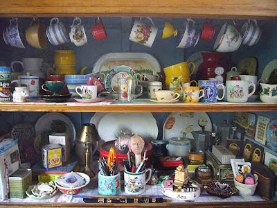
Above: my bathroom cabinet of curiosities, which boys can look at as they pee. These are a few of my favourite things:
A photo of my dear uncle Spaso, me (eyes shut) my brother (the little captain -- awwwwwww) and assorted cheeky cousins just outside Pucisca in 1974.

Po Chai Pills, from Hong Kong: "This medicine is good for fever, diarrhoea, intoxication, overheating, vomiting and gastrointestinal diseases." Super - and I just bought it for the box!


Three Flowers Face Powder by Richard Hudnut. "A powder Bouquet of SCENTED BEAUTY: Roses for ROMANCE, Violets for CHARM, Lilies of the Valley for YOUTH." I just opened it in the name of informing my readers, and the scent reminded me of old lady in damp coat on tram.


San Ing Face Cream. Made in Taiwan by the Shun Yih Chemistry Factory. This one also smells of old lady on tram, as well as the corner of a certain exotic supermarket on Victoria Street in Richmond. Unsurprising, seeing as that is where I found it.

Thursday, 9 July 2009

July in Australia

Some of my favourite bloggers (Elizabeth Dunker and Camilla Engman for example) are excusing themselves from their duties and taking a summer break. As I upload the photo above of my scarf in progress, (taken outside with autumn leaves in the corner as proof of which season we are in here in Melbourne), I remember with envy all the people I know in the Northern Hemisphere who are taking their summer break.
So, it is with this in mind that I generously present my dear Northerners with this little gift. A bit of exotic vintage Australiana to print, glue onto cardboard, cut out and use as a fan. Unfortunately none of my relatives will be out of the deep blue Adriatic sea for long enough to go inside and turn on their computers until well after their holidays are over.
...Well, I wouldn't!
(Image from Symbols of Australia by Mimmo Cozzolino and Fysh Rutherford, 1980. Previously discussed here.)

Sunday, 5 July 2009

Working 9 - 5: A Lady and a Robot

Above: the now famous doll face which I first posted here last year has a new sister! She is a bit of a flirt with her winking eye and Parisian beret. I like days at work when coming up with a new design means 'evolving' an old one, to put it kindly...
...Perhaps because it leaves more time to draw something new? Robots are not new, admittedly, but mine is a my own combination of about three or four of the most charming vintage tin robots that I could find on the internet. I like his lo-fi buttons and gadgets. His grin reminds me of that eager-to-please-stunned-rabbit expression that children sometimes wear in school photos.

Friday, 26 June 2009

The beginnings of a scarf

Recently I started gathering up some balls of wool in the colours that I like to wear when it's cold, declaring that I do not have a scarf which goes with my current wardrobe (a lie). I am actually feeling quite stressed at the moment, and thought it would be appropriate to make a start now. Because my idea requires combining quite a few disparate colours, I thought that I should sort out the design first. This morning I have been busy on Illustrator, re-colouring and combining bits of graphs from Seed baby sweaters that I designed years ago, and others that I had created for my own projects (e.g. the dogs). I wonder if it will be a bit boring to make a scarf which has already been worked out? Maybe I'll enjoy it more because I won't have to think.

For those who are not knitters: knitting is addictive. I am convinced that that is due not only to the fun of creating something, but because the physical act of concentrating on looping and counting stitches is quite meditative. Just what I need.

Sunday, 21 June 2009

Lady Wheelbarrow

Above: the new installment in the series begun a week ago with the lady and her very long hat (see previous post). I am still waiting for my readers' psychological assessments of this new obsession. No doubt it will resurface next week.

Friday, 12 June 2009

The Lady is the House

I have this urge to paint large objects on the heads of ladies in traditional costumes. There must be some pseudo-feminist agenda there: women bearing the load, etc., etc. Maybe it's personal too: a quiet form of panic setting in. Either way, it's obvious and unoriginal, but I have this need to go with it. (My next two pieces are in the planning stage already). Last night I went to the City Library and borrowed Taschen's mammoth edition of the incredible 1886 costume treasure trove by Auguste Racinet. The thing is so huge that I barely got it home, then barely dragged it to the studio today. Doesn't taschen mean pockets in German? I know that people probably wear big coats in Germany, but surely their pockets can't be a metre deep?!

This picture, above, actually started it all. In the original illustration (from a 1970s Burda magazine advertisement) the lady's headdress is not even as high as Marg Simpson's hair. I am not sure why I had the urge to repaint it so tall. (Any psychoanalyses welcome.)

Sunday, 7 June 2009

A Poster for Glenn Richards

Above: Graphic design is a branch of visual communication which tends to specialise in page layout, type and all manner of elements the viewer doesn't notice -- unless they fail to communicate. I am not a graphic designer, so when I am asked to do something which is about these elements, I freak out. Just ask David, who thought that I might enjoy doing a poster for Glenn Richards. "Don't worry about it, simple is fine" he said. Even within "simple" the possibilities for a designer are endless, and it seems that I prefer to make things hard for myself anyway. When I saw the photo that was to be included with the written information, I thought it was quite lovely and it made sense to let it be the focal point. And as I am not knowledgeable with type, I decided to create my own. Unfortunately, this took quite a long time: painting then scanning and cleaning up my little alphabet, then dragging the letters around in Photoshop. A simple job that went from lunchtime to bedtime and beyond. And don't bother asking whether I am happy with the result. REAL graphic designers get asked to do these jobs for good reason.

Sunday, 31 May 2009

Sandra's Awards Board

I am writing a gallery application today and choosing examples of completed work to use as a visual back-up to my case. Sandra's Awards Board is definitely not something that I completed recently, having shown it as part of the exhibition at Bus a couple of years ago. However I realised this morning that I had not documented it on my blog. When I look back on my work now, I definitely don't like all of it, and even more cruelly, can automatically see why. Fortunately, I am still quite fond of this one. At the time of the exhibition I sold it to a lovely young artist called Nicola. I hope that she still likes it too.

Wednesday, 20 May 2009

Working 9 - 5: a French truck and an air balloon

Cars are never far from my mind when I am coming up with ideas for Seed boys' t-shirts. They are usually a guaranteed hot seller, but that's only part of why I like them. Maybe it's in my genes? After all, my brother works as an automotive designer. Occasionally I even get to enlist the master's help. When Seed's head designer suggested that "an old French truck" would go well with the nostalgic European theme she was working on, I called my brother and asked which car models would fit the bill. I then scoured the net for photos. He tweaked the most decent shot that I could find into something that would be suitable to re-draw in the sharp side-angle that is a trademark of Seed.
Above: the finished product, which can also be seen here.

Above: speaking of hot sellers, this is a current one. I have always wanted to do an air balloon: I love watching them fly over my house in the mornings and have always dreamt of actually spotting my house from one. Besides, as a designer you can make them look so decorative. I also thought it might be mildly funny to have a bird hitching a ride in it.

Friday, 15 May 2009

Monster Competition Entry

My entries for an illustration competition for a book of monsters to be published next year by Murdoch. The winner gets to illustrate around 70 creatures dreamt up by the writer Peter Macinnis. I must say that I found doing just the three set monsters quite challenging: I assume that by the time the winner gets to monster number 69 it will get easier. I have learnt from this experience that I just don't exercise my drawing and sketching skills often enough, particularly when it comes to animals. A study trip to the zoo, or the Collingwood Children's Farm, is long overdue.

Above: my favourite, probably because I am very fond of pigs and because I like the colour palette. Actually, it's because I think I succeeded in making the Long Legged Underbed Pig look slightly annoyed by the little Aunt-eater running along its back. I wouldn't want my lunch interrupted, either.


Above: The Quarking Duck. Before I received the author's descriptions, I had thought that the monsters would resemble alien creatures, or at least something from recent films and cartoons with 'monster' in the title. Instead, Macinnis has concentrated on variations on the familiar, possibly to reassure his young readers that monsters aren't that scary after all. As a result, I am not sure that my pictures look like monsters. Perhaps that alien element was meant to come from me? Maybe that's why I couldn't help making the "trained shoe-lace monster" (not described beyond that) look a bit more strange.
Above: The Nose Ghoul, which I am least happy with. The monsters are not meant to be 'in-situ', but rather in a "static pose" with optional props. In this case, the fact that he is actually meant to be inside a person's nose gets lost. Perhaps another entrant came up with a better solution.


[Character descriptions copyright Peter Macinnis.]


Friday, 8 May 2009

Some Anthropomorphic Symbols

All images in this post are from the wonderful Symbols of Australia by Mimmo Cozzolino and Fysh Rutherford, first published in 1980. It has since been re-issued several times and is still available, including here. I don't own a copy, but I borrow it from the library time to time. Interestingly, each time I am drawn to different symbols. Above: Happy Foot: a foot powder symbol from 1925. The Keene Co., London.

Above: The lovely moustached Edwardian man seems to have been plonked onto the duck's body, but it works: he makes rather a handsome mandrake. Label dated 1919. B. Herbert, Sydney.

Above: Toppy Toppa. Toppa Ice Creams Ltd., Melbourne, 1952. Now that is a clever use for a "ribbon device".


Above: The Cricket Match. Sweden, c.1903. Double wordplay there: clearly it takes a non-cricket playing, non English speaking culture to note that. This one is for my cricket loving friend Kate Constable.


Above: This is where the anthropomorphic thing doesn't quite work. Art director asks "Could you please do that fashionable anthropomorphic thing with this box, and turn it into a lady?" Even Handy Ann looks bemused by her pathetic little square chest. Lever Bros. Ltd, Sydney. Perfumed soap, 1910.


This is where it does work. Above: 'Screw Man': the symbol that must have sparked my interest in these strange little anthropomorphic beings. I was so terrified of him when I was a kid that every time I would see him in my father's workshop on that little blue box, I would make a run for it. (Ditto that scary Michelin Man.) Funny how the things that you fear end up taking over your life. Sidney Cooke Pty. Ltd. Melbourne. Metal fasteners; 1940 version. Designed by Paton Advertising Services.

Wednesday, 29 April 2009

A 1970's Chinese Reader

Above: It would have been nice to be able to say that I bought this book in a back street of Shanghai or Kowloon in the 1970's when I was a little girl, but I didn't. I found it about ten years ago at a stationery shop in Chinatown here in Melbourne. Unlike our Prime Minister Kevin Rudd, I do not read Mandarin (or Cantonese for that matter), so I am unable to translate any of the characters. When I find someone who can help, I will post the results. Meanwhile, enjoy the enormous flowers, patterns, flared pants, attentive Chinese grandparents and slightly creepy realistic looking cat in the last picture.


Wednesday, 22 April 2009

Work in Progress: Decoration

Above: one of my favourite pastimes when surfing the net is peeking into other people's homes on Design Sponge. I thought that I would be brave and offer parts of mine for inspection too. I am always changing things at home, adding, taking away, moving or making. I get enormous pleasure just from re-arranging things.

Above: It is only a small change, but the addition of the little side table makes alot of difference to the lounge room, and it's great to have a reading lamp by the couch. Mostly though, it's just another excuse for another arrangement of flowers, books, and ceramics, to be changed as often as I like.

Above: visitors to my house, both big and tiny, tend to be drawn to the contents of the large kitchen cupboard. I have resisted any temptation to "style" the objects for its internet debut: unfortunately I can see now that there is alot going on in there and it's becoming a mess!

Monday, 13 April 2009

Some Greetings Cards for Seed

Above: one of the enjoyable things about the day job lately is the opportunity to design new products. It is relatively easy to translate my appliques into greetings card designs, especially as the "real" Seed graphic designer* is the one who actually sends off the final art with all the cropmarks, etc., included on it. Choosing which designs to print and which ones to leave out is harder! That's generally a decision shared by about 3 - 4 people. So really, I don't do all that much but provide the initial design and ideas for what colours it should be in.
Here, a motif based on a couple of photographs of model aeroplanes found on the net. To see how it appears as an applique, click here.
Above: the chicken which appears on bright blue and grey marle girls' t-shirts, has been changed to a more greetings card-commercial shade of pale pink. His colours had to be modified slightly to suit.
Above: this little owl is in sombre neutral colours for the customer who is presumably buying a gift for a baby which is still in utero. I have ceased to be surprised by the number of customers who still expect and adhere to the old "blue" and "pink" baby gender identifiers. So this is where my study of feminist theory at university has led me! Oh dear...
* "real" graphic designer, you ask? This is the person who looks after the signage in the stores, designs the carry-bags, labels, tags, gift-boxes, updates the layout of the website and sometimes even elements of the visual merchandising (during the tennis in January our little store mannequins made special Seed tea and in the springtime they gardened holding packets of Seed seeds). I look after the graphic elements for the products themselves.