Tuesday, 30 March 2010

Apple Man Doll


I have never used a t-shirt transfer before, and thought that the illustration that I did last week might be a good opportunity to try the medium out. Although somewhat shinier than I expected, the overall quality of the result seems good. I reckon that what makes this piece interesting is the blend of old and new: a new illustration influenced by centuries past, then the use of computer technology, vintage fabrics, and both hand and machine stitching to make a doll.
Not to mention good old fashioned writing on the new fashioned internet to show it off -- of course.

Sunday, 28 March 2010

A newly stitched scarf


The natural linen scarf that I already have in my etsy shop is quite well loved. It has 21 'hearts' but it looks a bit lonely there on its own so I thought I'd make it a companion. I am quite fond of this one: I hope that it gains a few fans too. And maybe even someone out there in the wide world who likes it enough to make it their own!


In case you are wondering, necessity was the mother of invention here. I saw some lovely (but expensive) woven striped scarves in a shop, but as I can't weave, I thought I'd try a different way to make a striped effect: by handstitching cotton thread onto already existing linen.

Thursday, 25 March 2010

Working 9 - 5: It's raining cats and dogs!

It's been a while since I have written a work related post. It's not because I haven't been working 9-5, more that I have been doing enough work outside of those hours to chronicle here, which is pleasing. I am quite proud of this bunch though: I like it when we go a bit nutty at work, and that's usually towards the end of the season* when there's less pressure to be commercial. Perhaps. Umbrellas print, above, raindrops and handles drawn in biro, scanned, auto-traced and completed in Illustrator. The umbrellas were drawn separately.
Above: Lady Cat, who will grace both girls' t-shirts and greeting cards from April. She is a bit grumpy, as I often am, especially when working 9 - 5.
Above: houses are a winning motif as far as I am concerned, and birds are a winning motif as far as the company's bottom line is concerned. Everybody's happy.

The boys get a funny dog wearing a long scarf on their t-shirts and greeting cards. Isn't Autumn just lovely?
* yes it is ridiculous that we consider April to be almost the end of the winter season in the fashion industry (in the Southern Hemisphere that is). I haven't even been to the shops to look at winter things yet. But maybe I'm the odd one. I'd love to know what you think about this system.
By the way, super Jaboopee AKA Elaine Prunty has completed her 7 Aesthetic Themes post and it is a gorgeous and encyclopedic aesthetic treat! Thank you Elaine!! And take heed slack ladies who have not yet completed theirs. They will not be named by me here but I will link back to my original post so that readers can work out who they are -- and find what the others did come up with! Definitely worth doing.
Thanks again also to Sandra from Pass the Parcel for her tag.

Sunday, 21 March 2010

Apfel Man

I am trying to be good, working on illustrations to add to my folio. Above is a combination of two current interests (obsessions?) the strangely proportioned German doll and the idealised landscape.

Thursday, 18 March 2010

1970's Japanese cross stitch


The Japanese have been cornering cuteness for a while: images above from Cross Stitch Designs, Ondori, Tokyo 1975.

Monday, 15 March 2010

Knitting Frenzy Part III: the yogurt landscape

I am completely enamoured with the various idealised landscapes that one might come across as tiny logos on food products usually manufactured in monolithic industrialised conditions. I'm not actually sure whether my interest in them has any political undertones. They're certainly cute, and I know that by looking at them I am reminded of food and art at the same time. I reckon that's reason enough.
Above: my Yogurt Landscape painting (previously discussed here) sits under this week's re-interpretation of a certain enormous European dairy company's logo as one side of a knitted cushion. (Don't tell anyone though.)

I have been a bit shy to admit that I was recently interviewed by Thea from Thea and Sami. Thanks Thea for taking an interest in my work, and for a lovely bunch of questions that were a pleasure to answer!

Wednesday, 10 March 2010

Ceramics class homework 2: friend or foe?

Franz the Little Wooden Man isn't sure what to make of his somewhat more nuanced friend. At least Franz can stand up: his clay mate, whose belly is already heading southward as he poses for this photograph, is a case in point.
I'm really looking forward to my teacher's help on this one.

Sunday, 7 March 2010

Knitted Bag No 3: a Spanish Princess


Knitted bag number three came to be without too many hitches, except that I still have difficulty heeding my own advice on how to work with different yarns. I enjoyed knitting the intarsia motif, which is based on a tiny picture of a crocheted Spanish princess in Bossert (one of my favourite sources). She also looks a bit futuristic, perhaps because I designed her just after watching Doctor Who last Sunday.
I'm really fond of the lining too -- a good quality American patchwork cotton bought at the sadly no-more Calico and Chintz and just waiting to bring a project together. I love that. Increasingly I want my crafting to be about using what I already have. That would already be plenty even if my mother hadn't been making presents of bags of wool for me lately. Now I have double.
Time to think of my next project. The previous post is the clue.

Thursday, 4 March 2010

Thinking about cushions

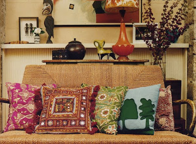
Do you ever look through your old magazines and wonder why you used to covet certain things in them? I do; but not in this case. Above and below The Paddington (Sydney) home of Ali Yeldham continues to intrigue me with all of its rich colours and textures. I love the intricate, exotic cushions next to the incredibly simple felt pictogram-like one. And I thought I'd include the photo below just because those beautiful plants and flowers look even more amazing placed behind that orange-red vessel. Vogue Living Australia, December/January 2003.

Below: another sort of striking cushion: a photographic printed one in the home of the super paper product designer Fifi Mandirac. It's such a cosy room too with that sweet little lamp, books and magazines within arm's reach and the tent-like effect of the white cloth draped above.
... Now, it's on to a few cushions of my own!